Talking About Our Christmas Crafts for Disability History Month

For Disability History Month this year, the theme is the arts. Disabled Living is proud of its history which is steeped in arts and crafts. This month, we would love to share some of these stories from our #DonkeysToInnovators archive and heritage project with you. Thank you to Heather Roberts for writing this blog post.
Christmas card crafts
Befitting the season is more from our astounding Christmas card collection. Following on from our sneak peek before we wanted to delve in a little deeper.
For this blog, we would like to share with you the first famous designer we know to have illustrated our cards.
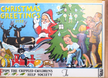
1907, Garth Jones
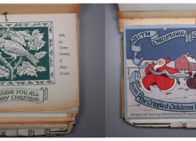
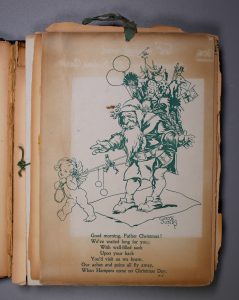
The first Christmas card that we know to have been designed by a recognised artist is the gorgeous 1907 print of Santa. Garth Jones (1872-1955) was a Mancunian illustrator and art teacher, notable for his designs in fairy tale and folklore volumes. He studied at what would become the Royal College of Art in London and later in Paris.
I absolutely love this item! You can definitely see a little fairy tale in the Christmas card. The cheeky little cherubim hauling a wayfarer troubadour Santa along with his wicker basket, reminds me of the English fables book my Nana would have by her chair (with ginger biscuits at the ready of course).
The poem
The lovely little poem is attributed to an M.K. It is highly likely this is Marianne Kirlew, Honorary Secretary for The Band of Kindness and Children’s Help Society (which was Disabled Living back in the day).
Our aches and pains all fly away, when hampers come on Christmas day.
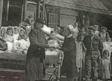
The pretty verse refers to the Christmas hampers which were given out to children either living with disability or otherwise home bound for Christmas due to illness. The Christmas card accompanied the hamper and would have surely brightened any child’s day.
As an archive
One of my favourite things about this card is how archive-y it is. Can you see what looks like a very precise tea stain on the card and some ghostly scribbled up top?
The outline shows where the card has been pressed against another item in the folio. It has remained there for so long that it has sort of protected the natural yellowing of the card. The scribbles are where ink has bleached and protected just that bit of card which it was pressed against. If you look closely, you can see that the writing is backwards, referring to the 1907 Christmas card.
The craft
This beautiful little design shows how the arts, illustration and poetry have been valued by Disabled Living for over a century.
We look forward to sharing more of these stories with you soon!