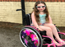
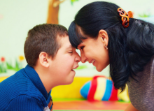
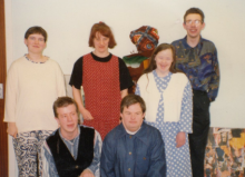
Colours vs. Special Needs Individuals: What You Need to Know

One of our contributors, Brenda Kimble, talks about the link between colours and people with special needs.
The language of colour
Tiny babies see best in black and white. But once they reach their first birthday, they will already begin to recognise and name colours. Colour is one of the first concepts we learn, and we use colour to convey emotion, messages and meaning. Red means passion, danger and stop! We feel sad when we listen to the blues.
Colours also seem to have a deeper effect than the common meanings we give them. To see a colour, you must have light. The colour of an object is determined by how much light bounces off it. Light is made of electromagnetic waves, and each colour has its own wavelength and magnetic frequency that interacts with the neuropathways in the brain.
Modern colour psychology is still in its infancy. There is little scientific evidence yet as to whether Chromotherapy, the ancient practice of healing using colour, has any basis in fact. What is clear is that the colours we choose to use around us, their intensity level and their interaction with lighting, can affect our moods, behaviour and performance.
Colours and special needs individuals
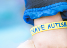
While everyone may benefit from optimising their choice of colour, some individuals may be more sensitive to colour. This is because some people have increased sensory responses, stronger visual processing abilities and differentiated cognition pathways. Typically, these might include individuals with Attention Deficit/Hyperactivity Disorder and Autism Spectrum Disorders.
Decoding the colour chart
Responses to colour are both physiological and psychological. Studies decoding the physiological effects of colours have shown changes in sensory sensitivity, blood pressure, heart rate and brain development. Psychological impacts include changes in levels of aggression, length and quality of attention span and ability to communicate effectively.

Warm colours
Colours like red, orange and yellow provide a high level of stimulus and increase energy and encourage creativity. This may make them a good choice for individuals with reduced sensitivity to external stimuli, such as the hyposensitive variant of autism, but a poor choice for individuals with ADHD and similar disorders.
Orange is a popular choice for fast food environments as orange increases noise perception and stimulates hunger and activity. Red raises respiration, heart rate and blood pressure. It also heightens the sense of smell.
Yellows, particularly strong yellows, can cause feelings of aggression, anger and frustration. Babies cry more in yellow rooms, and people argue and fight more in yellow environments.
Pink is neither warm nor cool and has a sedative effect. It has been shown to reduce aggression in prisoners.
Cool colours
Green, blue, grey and violet promote calm and a feeling of well-being. Blue reduces appetite and lowers body temperature. Blue is also the preferred colour for those with a visual impairment. Green helps to relax the nervous system and lessens feelings of stress. It seems to help with communication and developing speech skills. Cool colours may be a good choice for individuals where reducing stimulation is a high priority, such as those with ADHD or the hypersensitive variation of autism.
Colour preferences
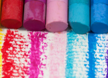
Each individual will have their own colour preferences, and in some cases, these choices will be very strongly felt and expressed. This can lead to distress if colour preferences are not acknowledged and respected. To identify colour preferences in individuals who are pre-verbal or struggle with communication, you can try laying out some clothes in different colours and see which ones they choose to wear. Or assemble a bowl of beautiful and tactile coloured beads or bright and cheerful crayons and let them pick out the ones that they like.

Colour at home
When decorating at home, you have the freedom to choose from a vast variety of possible colour schemes. Alongside aesthetic and colour preference considerations, consider making design choices that will enhance the mood and behaviour of the individuals in your family, including those with special needs. Consider basing your scheme around pink if reducing aggression is a priority for you.
Muted greens and blues are an excellent choice if you are trying to create a calming environment, if you are catering to the visually impaired or to enhance communication abilities. Use bright reds, yellows and oranges sparingly as small pops of colour to accent your decorating scheme unless you are deliberately setting out to create a highly stimulating environment.
Colours in the learning environment
The use of colour in a learning environment can profoundly affect student attention, behaviour and achievement. Many students with special needs are particularly sensitive to colour within the classroom. The trend for inclusive education in public schools and the increase in the number of students with special needs, including the wide range of learning disabilities, means the colour choices you make in your classroom are more important than ever.
As classrooms are communal spaces serving learners with a range of needs and responses to colour, deciding upon a suitable colour scheme presents some special challenges. Research into this subject shows that balance is the key. Classrooms which are too stimulating can have a strongly adverse effect upon learners with disabilities leading to behaviours such as hand flapping, repeated blinking, fixed gazing at lights and moving fingers back and forth in front of the face. These sorts of responses show links with reduced communication, weak concentration and less social interaction.

Classrooms which are too neutral and unstimulating are, in many ways, as bad as classrooms that overstimulate.
Colour schemes for classrooms
You might not have much say in the primary colour scheme for your classroom but, if you do have a choice, warm neutrals such as tan or sand would be an ideal choice. A slightly deeper hue in a similar colour would be a good choice for the main wall that students look at for learning purposes. Large blocks of bright primary colours are unhelpful, but you can try using soft shades of blue or green in moderation. Small amounts of brighter colours are used to define boundaries or as a background to charts and small displays.
Colour is one of the simpler ways parents and teachers can ensure they optimise the living and learning environment for individuals with special needs. Even in a communal space such as a classroom, there are plenty of ways to satisfy the colour preferences of individual learners. Coloured items such as paper and lenses and craft items such as beads all work well. For parents of children with special needs, using preferred colours as accents in clothing and decor is a great solution where individual colour preferences would not represent the best choice regarding the impact on mood and behaviour.
More blog posts by Brenda can be found by searching our main blog page: www.disabledliving.co.uk/blog